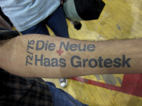
This one is for all the font geeks out there. Photo was shot by my friend Scott Beale (of Laughing Squid) at the MoCCA Art Festival 2010 in New York. No idea who the owner is unfortunately. The tattoo belongs to Rohan Mitra.
Ten points to the person that can identify it, but no points lost if you have to cheat and check out Scott’s post for an explanation.
ps: I’m also a guest blogger on Laughing Squid! </shamelessplug>


Such a better name then Helvetica…
I know this post is old, but I just found this site, and I'm a designer. I actually just got a geeky tat for designer purposes. It's Helvetica, which is typically a favorite typeface among designers. Grotesk is a word for early sans serif typefaces, and I'm pretty sure it just means the timeperiod it was designed in. Kind of how "gothic" buildings are called such for their style, not because they rock out to Marilyn Manson.
Accidenz Grotesk is another typeface that has grotesk in it, and is also a sans serif typeface.
Helvetica was, I believe, designed in Switzerland at a typefoundry, which is what the red plus sign is for.
Yea, Im a geek.
It was designed at the Haas type foundry, in 1957
Fuck I want that tattoo